Optimize the Look With Solarized

Web developpers or Apps developpers, IHM designers or Graphists how much time have you spent choosing the perfect color of your works?
Spending more and more time in front of screens, we care so much ( at least we should care ) about the relation between our eyes and applications. I believe most people have some of those experiences: under a big tree on a sunny summer day, the shaded paper contrasts with the crisp text nicely; Some black white website from a computer display tires the eye; Some application drives you crazzy with those confusing colors… How colors affect the look? What’s the right color for display? What’s the optimized color set for my application? Those are subjects related to tons of studies. Many projects have been developped to make our eyes more confortable.
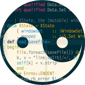
Project Solarized is a sixteen color palette (eight monotones, eight accent colors) designed for use with terminal and gui applications. This colorscheme is designed with both precise CIELAB lightness relationships and a refined set of hues based on fixed color wheel relationships. For short it’s human vision compliant. The project website itself is a demenstration. The author and other contributors still work on “Solarizing” many applications, check it out if your faverite editors or IDEs are already Solarized.